Comparer
<wa-comparer>
Compare visual differences between similar content with a sliding panel.
This is especially useful for comparing images, but can be used for comparing any type of content (for an example of using it to compare entire UIs, check out our theme pages). For best results, use content that shares the same dimensions. The slider can be controlled by dragging or pressing the left and right arrow keys. (Tip: press shift + arrows to move the slider in larger intervals, or home + end to jump to the beginning or end.)
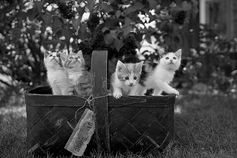

<wa-comparer>
  <img
    slot="before"
    src="https://images.unsplash.com/photo-1517331156700-3c241d2b4d83?ixlib=rb-1.2.1&ixid=eyJhcHBfaWQiOjEyMDd9&auto=format&fit=crop&w=800&q=80&sat=-100&bri=-5"
    alt="Grayscale version of kittens in a basket looking around."
  />
  <img
    slot="after"
    src="https://images.unsplash.com/photo-1517331156700-3c241d2b4d83?ixlib=rb-1.2.1&ixid=eyJhcHBfaWQiOjEyMDd9&auto=format&fit=crop&w=800&q=80"
    alt="Color version of kittens in a basket looking around."
  />
</wa-comparer>
Examples Jump to heading
Initial Position Jump to heading
Use the position attribute to set the initial position of the slider. This is a percentage from 0 to 100.
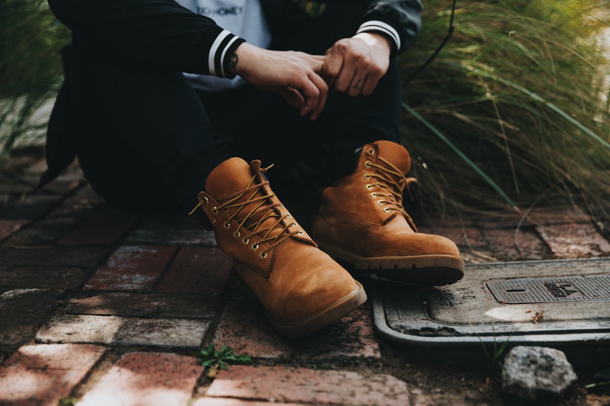

<wa-comparer position="25">
  <img
    slot="before"
    src="https://images.unsplash.com/photo-1520903074185-8eca362b3dce?ixlib=rb-1.2.1&ixid=eyJhcHBfaWQiOjEyMDd9&auto=format&fit=crop&w=1200&q=80"
    alt="A person sitting on bricks wearing untied boots."
  />
  <img
    slot="after"
    src="https://images.unsplash.com/photo-1520640023173-50a135e35804?ixlib=rb-1.2.1&ixid=eyJhcHBfaWQiOjEyMDd9&auto=format&fit=crop&w=2250&q=80"
    alt="A person sitting on a yellow curb tying shoelaces on a boot."
  />
</wa-comparer>
Slots Jump to heading
Learn more about using slots.
| Name | Description |
|---|---|
before
|
The before content, often an <img> or <svg> element. |
after
|
The after content, often an <img> or <svg> element. |
handle
|
The icon used inside the handle. |
Attributes & Properties Jump to heading
Learn more about attributes and properties.
| Name | Description | Reflects | |
|---|---|---|---|
positionposition |
The position of the divider as a percentage.
Type
numberDefault
50 |
|
Events Jump to heading
Learn more about events.
| Name | Description |
|---|---|
change |
Emitted when the position changes. |
CSS custom properties Jump to heading
Learn more about CSS custom properties.
| Name | Description |
|---|---|
--divider-color |
The color of the divider.
|
--divider-width |
The width of the dividing line.
|
--handle-color |
The color of the icon used inside the handle.
|
--handle-size |
The size of the compare handle.
|
CSS parts Jump to heading
Learn more about CSS parts.
| Name | Description |
|---|---|
before |
The container that wraps the before content. |
after |
The container that wraps the after content. |
divider |
The divider that separates the before and after content. |
handle |
The handle that the user drags to expose the after content. |
Dependencies Jump to heading
This component automatically imports the following elements. Sub-dependencies, if any exist, will also be included in this list.
Importing Jump to heading
The autoloader is the recommended way to import components. If you prefer to do it manually, use one of the following code snippets.
To manually import this component from the CDN, use the following code.
import 'https://early.webawesome.com/[email protected]/dist/components/comparer/comparer.js';